UX/UI Case study
3D simulator redesign
Brief
Redesign and improve the UI and UX of a 3D imaging application used by aesthetic professionals worldwide.
Objectives
- Reduce learning curve, training times and costs.
- Resolve many UX issues.
- Create a more marketable product with a new more professional looking design.
- Facilitate customisation of styles to create different themes for partners.
Target audience
Aesthetic professionals worldwide.
Scope and constraints
The main technical constraints were the following:
- Web based solution (Previous version was Unity based)
- Responsive from tablet to desktop.
- Localized to multiple countries.
Team members
The team included the following profiles:
- Product designer (me)
- 3D Engineer
- Web developer
- Quality Assurance
- Product owner
Fonts
Inter was the chosen font for the UI. With Inter, information can be read quickly, with ease and clarity. It is a professional looking, clean and highly legible font family. Its suitability for our sector is underscored by these qualities, making it an optimal choice for conveying information effectively.
Typography
A minor third type scale was chosen for the typography.

Color palette
To avoid using saturated colors, to comply with WCAG's accessibility standard. Desaturated colors were used in the UI following the color palette of the Crisalix brand. Eg. 400 was selected as the primary color.

Size and spacings
I chose the 4pt grid to maximize flexibility in laying out the UI and to achieve greater granularity in design precision.

Default elevations
Each component was assigned a default elevation. Certain components were positioned at higher elevations than others, establishing a consistent elevation order across all components. For example, modals always appear in front of all other components.

States
States were defined for all components.


Mobile first
Given that the iPad is the preferred device among doctors for using the app, and considering that a mobile version was beyond the project's scope, I prioritized designing all screens for the smallest-sized iPad initially.
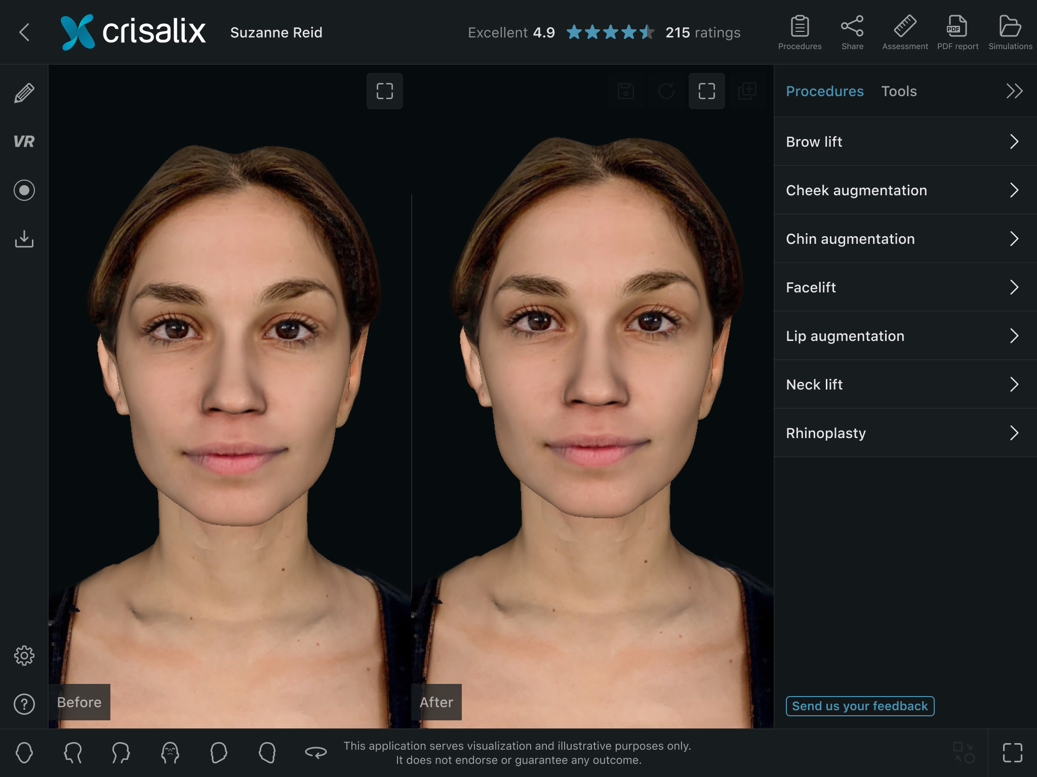
Main changes made
- Floating menu to side menu: The floating menu had many usability issues, eg. it obstructed the user's view of the 3D model, untidy, icons only were not intuitive and on tablet the user's hand covered the 3D model when using it. The side menu with text labels resolved these issues and is a common web pattern.
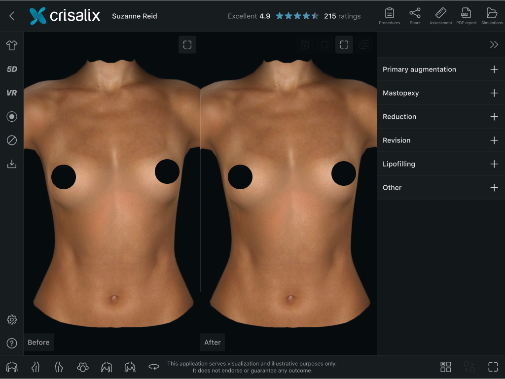
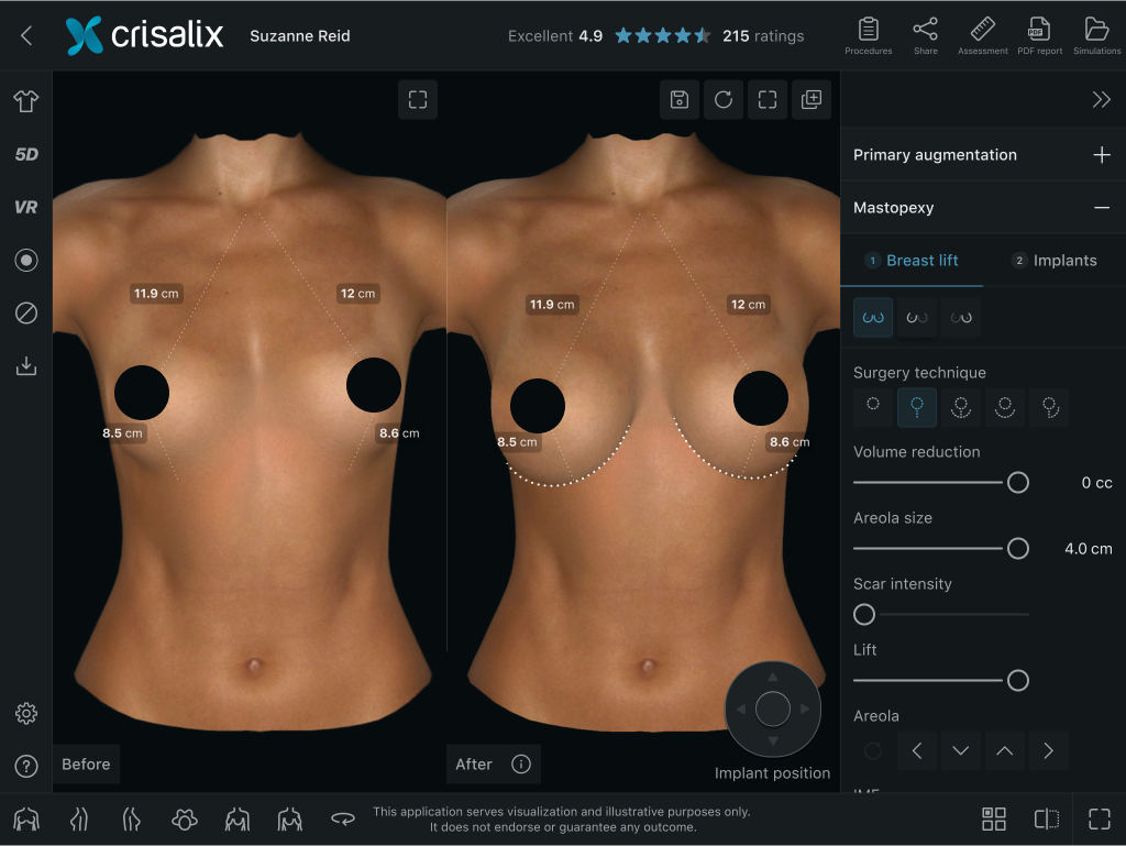
- Tool based to procedure based menu: Procedure-based user interface as opposed to tool-based, making it more intuitive for doctors who are on the whole less software savvy and more in line with their real-world workflows.
- Iconography optimisation and more usage of text labels: Icons were improved and more text labels were used to make each option clearer.
- All user flows: Analyzed and optimized.
- Dark mode UI: To enhance the aesthetic appeal dark mode was set as default, making the UI visually more attractive and meaning less important UI elements fade into the dark background to prioritize the 3D model.
Prototype & Figma file
PrototypeFigma file
Design (Before & After)
Floating menu to side menu
There were concerns over changing the design and postion of the floating menu as many users had been using the application for many years and were accustomed to it. However, as side menus are common among image editing applications and the new design with text labels made the menu more easier to understand, it proved to be the correct decision.
Before

After

Clothes menu
The preview thumbnails were improved and enlarged, and a color selector was introduced to make it easier to switch between colors as opposed to the arrow buttons in the previous version.
Before

After

Animations menu
Previews of the animations were displayed in the menu instead of icons to make each button clearer as to how the 3D model would animate when selecting them.
Before

After

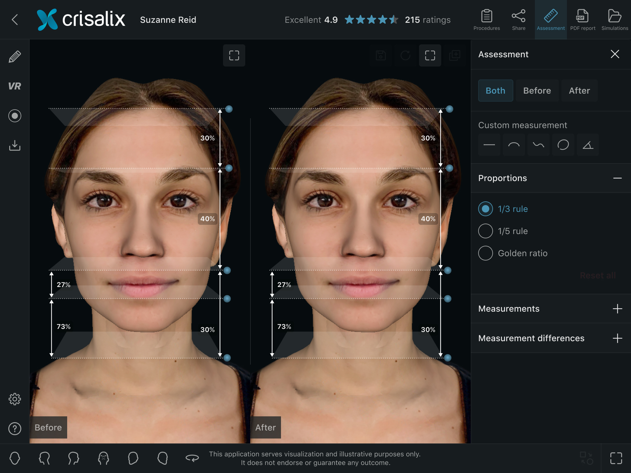
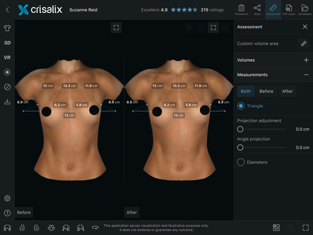
Measurements
Design of the measurements that appear on the 3D model were optimised and were aligned with the color palette used in the UI.
Before

After
Before

After
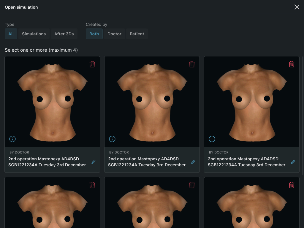
Open simulations
Thumbnail previews of saved simulation were enlarged to help users identify specific simulations more easily. Filters and allowing the user to edit simulation names was added.
Before

After
Settings
Settings were distributed into categories and the menu divided into two levels, to reduce clutter and better organise the different options.
Before

After

Before

After

Before

After
Before

After